This article is dedicated to the different application methods used for applying/installing self adhesive vinyl signs and window graphics. Many of our safety signs come with a self adhesive vinyl option making

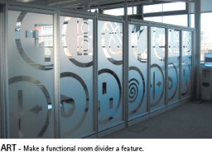
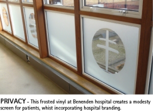
frosted vinyl screen, glass highlighting

them very versatile and easy to install. We also offer a range of frosted vinyl window graphics in both standard and custom-made designs. Glass Highlighting can also help you comply with Regulation 14 of the Workplace (Health, Safety and Welfare) Regulations 1992. The Regulation requires the marking of windows and glass doors to make them conspicuous.


How to apply your vinyl signs and graphics

Before applying any self adhesive graphics make sure that the application surface is clean and free from contaminants. To apply your self adhesive graphics, use one of the following methods:

For Small Sizes (up to approximately 20 x 20cm)

1. You will need a squeegee.  ( a small rigid plastic card designed for sign applicating, if you can’t get one, a small professional window cleaning one will do, or even an old credit card)

2. Remove the backing paper from the face material.

3. Position the sticker/sign on the surface and press in place with finger tips.

4. Apply the sticker to the surface with squeegee, using overlapping strokes. Puncture any air bubbles with a needle and press in place.

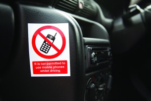
mobile phones, prohibition, safety signs

For Medium Sizes

1. You will need a squeegee (see above).

2. Remove 3-5cm of the backing paper from one edge of the sticker and fold back.

3. Position the sticker to the surface and press the exposed adhesive area in place with finger tips.

4. Apply the sticker to the surface with squeegee, using overlapping strokes, removing the backing paper little by little with the other hand puncture any air bubbles with a needle and press in place.

Wet application method for large sizes

1. You will need a squeegee (see above), sponge or cloth, water plus a little liquid detergent (i.e. washing up liquid), agitated to produce foam bubbles.

2. Temperature of the application surface and in the workshop should be 15°C or above.frosted glass, room divider, glass highlighting

3. Wet the application surface entirely with foam bubbles.

4. Remove the backing paper, keeping the sticker flat.

5. Apply the sticker to the wet surface and bring into position.

6. Remove any excess foam bubbles from underneath the sticker with a squeegee, using light pressure in overlapping strokes, working from the centre. Dry the sticker with a cloth.

7. Secure the sticker to the surface with a squeegee, using overlapping strokes and firm pressure, paying particular attention to the edges, to ensure a firm bond.

8. When possible, check and re-squeegee firmly after 24 hours.

*note – With this application method ultimate adhesion of the sticker/sign is reached later than with a dry method. The sticker/sign will obtain ultimate adhesion about 24-48 hours after application.
While safety signs may not have been at the top of your Christmas list, this time of year is the perfect time to carry out a signage audit of your premises. The beginning of year is always associated with fresh starts, out with the old and in with the new. We often get renewed energy which gives us the impetus to start new projects or clear the decks in anticipation of what January will bring.

Taking Stock of your Safety Signs

Take time to walk round your premises, it may take a couple of trips round if you have a large or complicated building layout. Note all your existing fire safety signs. Do you have all the necessary signs covered by legislation? Through the course of the year things happen to your building, were signs replaced after that wall got repainted? were your signs covered up when you had the last office move round? Many people find that their fire signage is often in the wrong place, check your emergency escape signage is being displayed properly. If you are not sure whether you are completely covered legally get a site survey done to give you peace of mind. While it isn’t yet a requirement to change all your existing safety signs to the new ISO7010 versions make sure any missing or damaged signs are replaced with the new updated symbols.

Care of your safety Signs

Safety signs over time can become dirty or damaged several environmental factors can effect your signs. Signs in areas of high traffic can become dirty quickly. Make sure all signs are clean and clear and be easily read, cleaning where needed. If they are illegible and beyond cleaning replace where necessary.

Signage Clutter

Have you got too many safety signs? are the messages you are giving out confusing? If it is a high hazard area consider replacing a number of your signs with single multi message signs. Having your safety information in one place will not only look smarter but will help reduce sign blindness- where people are so used to seeing the same signs day in day out they in fact cease to register seeing the signs at all.

For more information about safety signs or any other signage query please contact our sales team sales@stocksigns.co.uk.

Roger Bibbings, RoSPA’s Occupational Safety Adviser talks about how, during these times of austerity, now is not the time to cut back, but instead invest in health and safety. Safety Signs can be a key part of this.

Safety signs are a cost effective way of enhance your safety policy. They can be used to warn of inherent dangers, they can be used to promote safety awareness and used as training aids in safety training. A site survey from Stocksigns can help ensure your premises meet current legislation and best practice.

http://youtu.be/oDBG5OPlPmk

We are often asked by our customers which fire exit sign they should use where and with which arrow? This simple guide will help you to select the right signs for your premises and keeping within current legislation. The directional arrows are designed to give visual instructions of the safest route to take in the event of an emergency.

A site survey of your premises can help you ensure your emergency escape plans have the correct signage and can form part of your safety risk assessment.

Below shows the directional arrows and their meanings on Emergency Exit Signs

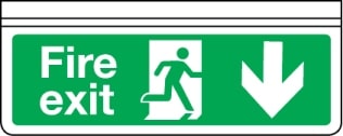
 Fire exit sign - arrow down Progress down from here    
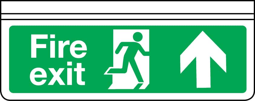
 Fire exit sign - arrow up Progress forward from here or progress forward and through here. The most commonly used emergency escape sign often seen above doorways.    
 Fire exit sign - arrow right Progress to the right from here    
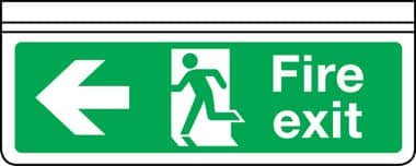
 Fire exit sign - arrow left Progress to the left from here    
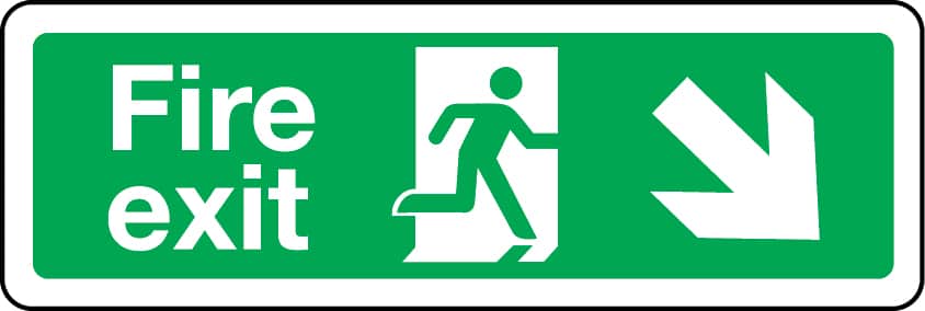
 Fire exit sign - down right Progress down and right from here    
 Fire exit sign - down left Progress down and left from here    
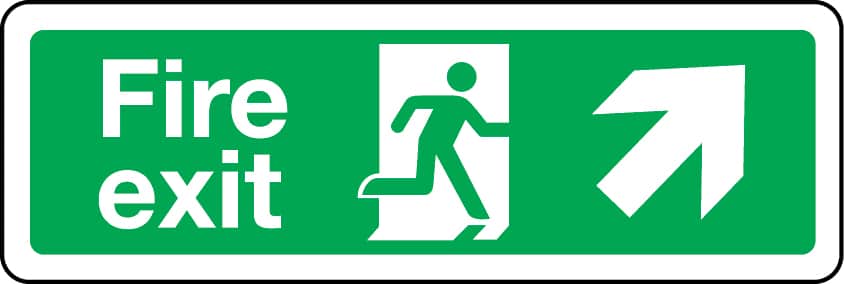
 Fire exit sign - up right Progress up and right from here    
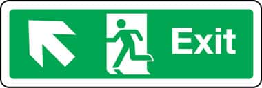
 Fire exit sign - up left Progress up and left from here    

Stocksigns has long been famous for manufacturing good quality traffic signs, and boasts an extensive range. The importance of traffic warning signs is evident from their common place use but here is what RoSPA (Royal Society for the Prevention of Accidents) says about Traffic Signs and their use for protecting children.

RoSPA’s Traffic Signs Guide

Traffic signs are a common site through out our road network or where children have to cross, or walk adjacent to a road, to access a play area some form of traffic control is advisable. Whilst most measures are beyond the resources of the smaller authorities, the provision of general traffic warning signs advising motorists that they are approaching an area where children play is economic and is advised. There are standard signs available and in most cases the relevant highways authority will provide such signage.

Signs should be clearly visible from all approach directions and should be positioned sufficiently far away from te area to enable motorists, if necessary, to adjust their speed to an acceptable level. The signs should be placed so as not to be obscured by planting growth.

Speed limit signs not only (hopefully) reduce motorist’s speed but also raise their awareness of the presence of children.

As well as providing traffic signs care should be taken to ensure that planting, other road signs, or other roadside materials do not obscure sight lines for both motorists and pedestrian. This may mean keeping hedges and verges well cut back.

Stocksigns and RoSPA

Stocksigns is RoSPA (Royal Socisty of the Prevention of Accidents) official safety signs partner. Read more about our safety signs partnership.

There has been much talk recently about signs pollution, the proliferation of signs all over our town and countryside, from high street to motorway, from factory to farm. Which not only can blight our landscape or built environment, but also cause confusion by virtue of the sign’s own cluttering promiscuity.

Does this apply to health and safety signs?

Not so, in our view. First, the very purpose of properly located and appropriate safety signage is to protect staff and visitors on your premises, when all other means to mitigate a risk has been considered an actioned. In this case “familiarity does NOT breed contempt – rather the continual and consistent viability of such safety aids increases awareness and comprehension of the potential dangers and the means of avoiding or evading them. This is not just a negative “do not” approach as is evident from essential use of fire and emergency exit signs in their various forms.

Secondly, the key to effective health and safety signage starts with the comprehensive assessment of the risks in a workplace and, where these can not be avoided, the selection of the most appropriate signs – which in many cases, separate safety messages can be incorporated in one multi-purpose sign, so quite legitimately saving space and money.

Safety Signs Training

A further crucial ingredient is the general level of safety awareness that is developed within your organisation, and in particular, the education and training of staff with respect to safety signs. Here, there are a number of aides, such as pocket guides (for example, these can be included in an induction pack) and the Health and Safety Law Poster that are in any event a legal requirement to display.

In all these areas Stocksigns can help, although ultimately, of course the responsibility lies with you. Our advice, a combination of physical surveys and the wide range of signs on offer, will eliminate the over-use of signs, but protect the organisation, and its employees and visitors, which after all, is the whole point.

No-one wants to go overboard about safety in schools, any more than they do about every day living elsewhere. And, of course, schools take the matter of safety for everybody involved – not only pupils, but also staff and visitors, who are equally important – very seriously.

However, it is worth reviewing not just the provision of, say, signage, but also how well it is understood. Stocksigns has a long tradition of innovation in school signage, (for example created new designs for laboratory safety signs some 15 years ago) and our latest schools catalogue has been developed to be particularly user-friendly throughout the school environment.

One such way is the use of friendly fonts and graphics which more easily grabs the attention of the pupils so that they more closely identify with the message. This helps comprehension.

Sign design for a large number of safety signs is more formally required by legislation and/or relevant British Standards. This is necessary to ensure consistency across all possible premises in which they might be used, for example fire exit signs and emergency escape signs.

Outside these sensible constraints, however, some imagination can be brought to bear, which reflects on a school’s individual ethos and style. So, a sign can be chosen from the Stocksigns catalogue or designed by the school, whether or not using our custom signage design expertise and experience, to produce something unique for your school.

Then not only will you have the assurance that you comply with the statutory requirements, you can have a signage system which is a little bit special to your school. You can enlist the creative spirit of the pupils (or even staff) which will give an even greater sense of achievement. For ideas, why not let us send you, if you don’t have one already please request a copy of “The Sign Catalogue“.

Just because there is statutory requirement for all non-domestic premises to have the right fire safety signage, there is no reason that fire exit signs cannot be used imaginatively to fit in with your building design and decoration.

Here are some examples of the different ways that a compliant fire sign can be used.

1. Wall and ceiling mounted signs are very useful when for example, space is at a premium or there is a low ceiling.

2. Sign frames can add impact to the sign message. One option is to fit the sign into the appropriate sign frame, which can be suspended or wall mounted. Alternatively, for a more design conscious solution a Vision MX frame system, which can of course be double sided.

3. Wall mounted projecting signs increase visibility from several directions.

4. Sometimes conditions require the use of an extra large sign, particularly in public places. Extended view of up to 40 metres can be achieved with signs 1200 x 400mm in size.

5. Again, constraints of design or purpose may require the use of “portrait” style fire signs, for example multi-storey car parks.

6. An innovative aid is the use of fire exit floor graphics as part of a wider safety sign installation.

7. Two larger luminaires are available, for when this type of signage is required or chosen. The cylinder range comes in various options for mounting and is an elegant solution. At a very practical level are the BSI certified metal exit signs which are extremely good value for money.

8. Photoluminescent signs are both effective and alternative choices, and can be used with several of the options available to the standard fire signs.

9. Signs for the physically impaired are part of the provision that can be required under the Disability Discrimination Act. They also show an employers awareness and sensitivity to the needs of this often overlooked section of the community.

10. “Tactual” signs are particularly relevant to the visually impaired, with the wide spaced raised text incorporating Braille. Braille signs fully conforming to BS5499-2:2002 and ISO 7010, as well as Technical Bulletin 24 of the joint Mobility Unit, part of the RNIB.

11. The Hospital Sector has developed a range of fire escape signs, specifically for the sector but have proved popular in other fields too.

12. Finally there is a range of “Standard Enhanced” signs with clear acrylic and satin chrome panel supports – a very aesthetically pleasing choice, which complements the design aware decor of an office, shop etc. All in all, a much larger selection of fire and emergency escape signs than perhaps one might have imagined. The good news is that Stocksigns can supply all the ranges listed above. Why not think seriously about how you enhance your signage.

Making Provision for the Disabled – It’s not just about the law or wheelchairs.

Since the introduction of the Disability Discrimination Act 1995 (DDA) all service providers, whatever their size have had to make reasonable adjustments to the physical features of their premises to overcome any physical barriers to access.

One key element – and a relatively low-cost one at that – is disability signage. Below we set out the background to the legislation (and the need) and show how reviewing one’s signs can have a big impact on fulfilling the legal, practical, and moral obligations of our fellow citizens.

Disability Discrimination Act 1995

“why bother it doesn’t effect me…does it?”

It does effect any business that provides a service, whether it’s free or paid for. Prior to 1st October, part 2 of the DDA only applied to companies that had more than 15 employees. However, since 1st October, ALL employers must comply with the DDA’s provision on employment and occupation. There are approximately 8.6 million people with disabilities in the UK. Their estimated annual purchasing power is between £40 and £50 billion.

“What are ‘reasonable’ adjustments?” – they must be specific to the building and the type of service being provided. Provisions should not just be restricted to improving wheelchair access, only 5% of those with disabilities are in wheelchairs.

  • There are 600,000 wheelchair users
  • 2.5-3 million visually impaired
  • 1.5-6 million reading difficulties
  • 8 million deaf or hard of hearing
  • 15 million mental health difficulties
  • 1 in 3 people over 55 have Arthritis

(source: Department for Inclusive Environments University of Reading)

BS 8300:2001

The British Standard gives dimensions and details of the physical requirements needed in order to comply with the DDA as well as signage requirements.

Disability Rights Commission

The DRC not only provides help for disabled people, but also produced a Code of Practice and various guides for service providers.

If you are a service provider or an employer, you need to:

  • assess the problem, or better still
  • have an access audit done
  • contact local access groups
  • produce an access plan

Once you know which physical features may make it difficult for disabled people to use your services then the law gives you a choice.

  • you can alter the feature
  • you can remove the feature
  • you can find a way of avoiding it
  • you can provide the service in another way

The DRC strongly recommends the ”inclusive” approach. Removal or alteration of a feature is the most likely option to ensure that disabled people receive the services in the same way as other customers.

What areas should be considered when making reasonable adjustments

  • Routes to and around buildings
  • Designated car parking bays
  • Building entrances and exits
  • Directions to facilities – lifts, toilets, etc.
  • Information on services available to the disabled
  • Clear indication of help points
  • Emergency exit routes and disabled refuge points
  • Enhancement of general information signage

Where to install suitable DDA signage

“Signs should form part of an integrated communication scheme that gives clear directions, information and instructions for use of a building” – BS 8300:2001. Signage that complies with the DDA is based on the guidelines shown in the Sign Design Guide and developed by the Joint Mobility Unit.

Important things to consider when buying DDA signage

Text in upper case

Upper and lower case text provides a recognisable “footprint” even if the text can’t be read.

Letter Heights

Viewing Distance Type of sign “x” height in mm
Long Distance External Fascias 200mm
External location 90 – 120mm
External Directions 90mm
House numbers 90mm
Medium Range Location & Direction 60mm
Identification signs 40mm
Close Range Room Identification 35mm
Directories 15mm
Wall mounted information 15mm

Good Contrast

Black and white provides the most obvious contrast but can cause halation for some people due to the extreme contrast and glare.

So we are looking for:-

  • Clear text in upper and lower case
  • preferably white text on a darker background
  • letter heights based on BS 8300 or “Sign Design Guide”
  • good contrast between text and background
  • a white border to emphasise the sign
  • a matt finish to avoid glare

Position of signs

Consistency of sign height and position throughout the building is important. Signs should be placed between 1400mm and 1700mm for visually impaired persons when standing. For wheelchair users signs should be placed between 1000mm and 1100mm above floor level. Signs associated with control panels, e.g. lifts or door entry systems should be located between 900mm x 1200mm, to meet the needs of both wheelchair users and people standing.

Designated Car parking

  • Parking bays and floor graphics – one space for each disabled employee plus 2% of available spaces.
  • disabled parking bay signs
  • directional signage to reception or other areas
  • contrasting bands of colour on posts or columns
  • door entry signs

Information Signage

  • The reception point should be clearly signed
  • signs indicating lifts, stairs, and other parts of the building
  • Facilities on each floor should be shown on landings and stairs
  • clear floor level signs in stair wells and by lifts
  • orientation signs in large buildings
  • directional signs, there and back
  • disabled toilets, telephones, induction loop signs, etc.

Escape Route Signage

  • General escape route signage may need to be enlarged
  • Fire Exit signs to include routes to disabled refuges
  • emergency evacuation lift signs
  • Clear signs from the building to the assembly areas

Compliance with the DDA is not about avoiding being sued or fined but about caring for staff and improving your service for everyone.

At the end of March 2006 there were 364,615 people in the UK who were registered as severely sight impaired (blind) or sight impaired (partially sighted) – RNIB. The Tactual Braille signs range from Stocksigns is the innovative and visually superior tactile signage system. Braille signs are capable of conveying fast, effective information to assist the visually impaired. They should be used to clearly identify exits, restrooms, entrances and other rooms for the visually impaired and also assist in way finding and navigation through your premises. Braille or Tactual Signs provide facility information in Braille for the visually impaired and also in bold letters and graphics for those who are not.

Braille Signs – Tactual from Stocksigns

The Stocksigns Braille signs range – Tactual – fully comply with Technical Bulletin 24 of the joint Mobility Unit. The JMU is a service provided by the RNIB and the Guide Dogs for the Blind Association. Tactual signs may be manufactured to suit individual needs including a range of text options, panel colours and layouts. We can advise you on your own legal obligations and ensure that your workplace is complying with the appropriate regulations. Braille can be incorporated into your corporate signage to extend the audience range and the reach of your signs. Braille can be included in information and tourist interpretation boards to extend their accessibility and contact points, such as emergency assistance points, with Braille offer help to vulnerable members of the public.

Stocksigns only supply Braille signs that we manufacture ourselves. As a result not only can we be sure that they are of the highest quality but also that we have the technology and expertise to manufacture any custom made sign with Braille to our own specification.

What to look for in Braille Signs

When choosing braille signs from any supplier make sure they have the following features:

  • Wide spaced, raised text.
  • Highly durable, accurate, grade 1 Braille.
  • Braille locator.
  • Low gloss surface, high contrast colour range.
  • All safety symbols conform to BS 5499-5:2002 and ISO 7010

We also supply many other types of disability signs, including disabled parking signs and induction loop notices for the hard of hearing.

Help protect your staff or family with the Stocksigns Smartsign™

The award winning Smartsign is designed for use on surfaces changing from cold to hot, immediately warning people of a dangerous hazard and helping reduce accidental burn injuries.

– Displays the word ‘HOT’ when the surface temperature reaches 50°C / 122°F

– Designed to “BS 5499 part 1” and conforms to the “Health and Safety (Safety Signs and Signals) Regulations 1996”

– Used in both domestic and industrial environments. Ideal for items that remain hot even after being switched off and the user might assume it has cooled down.

Smartsign Applications

Appllications include water heaters, fan heaters, generators, boilers, motors and hundreds of machines/appliances. It is designed for surfaces that regulate temperatures within the range of -30°C and +90°C away from direct UV light.

Smartsign Case Study

Care Unlimited, a group of care homes in Surrey, have had Stocksigns Smartsigns installed.

Surfaces within the homes that change temperature such as water heaters, oven doors, kitchen appliances and machinery have had the signs applied. The signs display the word “HOT” when the surface is above 50°C / 122°F. This sign is particularly useful for Care Homes as children and the elderly are at a higher risk to burn injuries due to sensitive skin.

Reza Shamtally, Care Unlimited Partner comments, “Smartsign is cost-effective and clever in design. It will no doubt help minimise unnecessary burn injuries within our care homes for employees and clients”.

Stocksigns can manufacturer a wide range of commemorative and memorial plaques and nameplates including engraved plaques, etched plaques, vitreous enamel, screen printed plaques, cast aluminium, slate and other natural materials. So whether you are looking for a professional nameplate or heritage sign we can guide you through the choice of materials and manufacturing techniques to make your ideal plaques. 

Here are some factors to think about when choosing your Memorial Plaques:

  • When choosing memorial plaques first work out what text you want to include. The shape of the plaque can depend on the length of the text line. For example, an oval shaped plaque will only accommodate long lines of text in the middle of the sign, where as rectangular or square plaques are suited to where there are long lines of text at the top or bottom. By including braille on your memorial plaques you extend your signs accessibility to the visually impaired.
    • The choice of material is also equally important. Cast signs or signs mounted on a wooden back plate are ideal as presentation plaques. Stainless steel gives a modern feel while polished brass is often the preferred choice for professional services nameplates. The engraving and etching process add depth and texture to your sign. The use of a time-honoured natural stone such as slate creates a distinguished looking durable sign.


www.stocksigns.co.uk 

Stocksigns the health and safety signs and custom made signage manufacturer
Stocksigns for all your signage needs

Beach Safety – RNLI Beach Safety Signs

The hottest April on record certainly drew us all to the sea – or so it seemed judging by the traffic jams over the Easter weekend. With this earlier than usual start to the “beach Season” its worth reminding ourselves that the seaside can be a dangerous environment if lack of awareness or respect for the power of water leads to complacency and then possibly onto tragic drama. How can we look after our own beach safety and that of our families, as well as that of others, when we enjoy that Great British institution – a day at the seaside?

Another iconic institurion, the RNLI, has been at the forefront of a campaign to improve beach safety as part of its overall role as ‘the charity that saves life at sea’. Ever since 7 years agowhen a four year old boy was drowned whilst on a beach in Cornwall, the lack of information through signage was seen by Ryan’s mother as a major contributing factor to this tradgedy. Subsequently the RNLI have produced an extremely comprehensive guide to beach safety, in particular the use of beach safety information signs.

For safety at the beach, of course, it is not enough just to put up beach safety signs and have an understandable system of warning flags; people who visit the beach have a responsibility to ‘read, mark and inwardly digest’ what the signs and flags mean, as well as keeping an eye out for the safety of in particular theirs and other children.

When you go to the beach, check whether the facility has been signed up effectively – the signs are on both the RNLI website and the Stocksigns web catalogue (RNLI approved) pages 142 and 143. Here are some examples.

If not, why not tackle the operator or the local council about their absence. It may save a life. Above all, be aware and sensible, we know that water can be terifyingly destructive.

For information on general beach safety signs and their means visit our post water safety signs

As the days lengthen and the temperature rises, so does one’s enthusiasm for taking the bicycle out of the shed and setting off down country lanes, along old railway lines or taking the cycle paths or lanes that are now available to make cycling both more enjoyable and above all safer – safe for both cyclists themselves, as well as other users of the public highways.

Bike safety – bike accessories & cycle routes

Obviously we have to make sure our own bicycles themselves are safe, before pedalling off – tyres, chains, bike lights, cycle helmets and brakes all need to be checked. After that we have to look at our own cycling safety particularly on Public roads and especially in the presence of large vehicles. Nowadays you can see special cycle safety signs on the back of lorries warning of the visibility problems that drivers can have if you get too close.

Secondly, cyclists should use dedicated lanes or pathways (which should be clearly marked with “bicycle only” signs) both for their own safety and out of consideration for others. Life can be so much more relaxed and enjoyable with a bit of common courtesy – ‘do as you would be done by’ is a useful mantra. This cuts both ways of course, and motorists have not only to respect specific cycle routes but more generally need to be aware of other road users, as do cyclists in relevant circumstances. Sometimes exclusive cycle parking locations are provided. Please use them for the security of your own property at the very least.

It goes without saying the law and Highway Code needs to be obeyed. Don’t cross traffic lights at red, for example, or ride more than two abreast. Above all everybody should use their own common sense.

Safety is the responsibility of every road user, and this coupled with politeness, can make the outing, however short, on self powered two wheels an enjoyable and life-enhancing experience- On your bike!

For more information on road signs and bike safety signs visit our on line traffic signs shop or call 01737 77 40 72.

Hazard safety signs play an essential role in the management of your safety, warning your staff and visitors of any potential dangers on the premises.

Hazard signs have a yellow triangle with a black pictogram or symbol on a yellow background with a black border. The yellow part has to be at least 50% of the area of the sign. Many of the hazard symbols currently used have been updated to bring them in line with the new ISO 7010 legislation.

Each sign is categorised as the above depending on the severity of the risk. For example, signs with the word “Danger” are used where the risk is deemed to be higher than those signs using the word caution.

(more…)

In situations of emergency evacuation, especially when confronted by power failure, a way guidance system using photoluminescent signs and markers will help to indicate clearly defined escape routes, saving critical time for the evacuation of the building.

BS 5266-6: 1999, is a Code of Practice for non-electrical low-mounted way guidance marking using a photoluminescent system. It recommends how to plan, design, install and maintain the system when used in conjunction with powered emergency lighting. The use of this standard, combines with BS ISO 16069:2004, Graphical symbols – Safety signs – Safety way guidance systems and BS 5499-4: 2000, Code of Practice for escape route signs, gives the answers to most questions that could be asked from those contemplating installing a photoluminescent way guidance system.

The installation of a photolumiescent way guidance system does not replace the use of powered emergency lighting when this is required, but compliments its existence. For a satisfactory performance, photoluminescent materials require initial activation from a good light source.

The recently published part II of BS5499. provides a uniform family of water safety signs based on the signs produced by the National Water Safety Committee. These signs should be used at all locations where sport or recreational activities are taking place, to warn the public of possible hazards or dangerous situations and to give specific instructions for their safety.

There are three main types of water safety signs you will find when you are around water. Each one has its own meaning, but all of them work to the same system. If you go to the seaside, then there are sometimes special flags to also look out for.

In addition to the water safety signs, you will also find information signs telling you where the toilets are or where you can get first aid. They will also tell you where the public rescue equipment is held.

Water safety signs

1. Hazard Signs

  • Triangle shaped
  • Yellow background, with black symbols
  • They are placed to help you spot a hazard that is not always obvious

They mean that you should be aware of something.

2. Prohibition Signs

Signs that mean you should not do something, are always:

  • A red ring shape, with a line running through
  • White background, red line and black symbols or shapes
  • They inform you of things you are not supposed to do

These signs tell you that it would be dangerous to do something, or go in that place.

3. Mandatory Signs

Signs that mean you should do something, are always:

  • Blue and circle shaped
  • White symbols or shapes
  • They inform you of things you need to do

These signs tell you that you should do something to be safe.

Other signs you might see

Information signs, are always:

  • White background
  • Black symbols or text

These signs help you either find something, or get somewhere.

First aid signs are always:

  • White symbols or text

These signs tell you where important safety items are such as the first aid place, or the emergency telephone.

Water safety flags

At beaches there are flags to tell us when and where it is safe to use the water.

This red flag means it is unsafe to be in the water.

Under BS EN 3 operative from the 1st January 1997, all new certified fire extinguishers used in European Union countries must feature red bodies. In line with familiar UK practice, BS 7863 allows manufacturers to affix coloured identification panels on or above the operating instructions covering no more than 5% of the body surface area and visible through a horizontal arc of 180 degrees when the extinguisher is mounted.

The new harmonised European standard on fire extinguishers – BS EN3 –  which came into effect in 1st January 1997, provides a single standard for fire extinguishers across Europe. It replaced the old British Standard BS 5423, which has now been withdrawn.

BS EN3 is the standard now used for the specification, manufacturing and purchase of extinguishers in the UK. An additional standard BS 7863 details the revised colour coding system and supplements BS EN3.

BS EN3 is not retrospective and pre-existing extinguishers do not need to be replaced with extinguishers to this new standard. However, any replacements as a result of damage, wear or un-serviceability or new extinguishers will need to meet this new, later standard. While BSEN3 has now been in place for a number of years, understanding the colours and codes should be part of your regular health and safety training and form part of your new staff induction programme. There are a number of resources such as Fire Extinguisher Colour Guide Code Charts that can serve as staff information points and training aids. Fire Extinguisher location panels can aid your routine premises maintenance. As well as providing information on the use of the particular fire extinguisher mounted they also give a visual warning as to when the extinguisher has been used and not replaced.

The New Standard Fire Extinguisher Standard
The main differences between the old and new standards are:

  • A minimum of 95% of the extinguisher body must be red
  • Zones of colour, indicating the contents of the extinguisher, are permitted
  • The markings on the extinguisher must follow a specified layout
  • Pictograms are used indicating the type of fires that the extinguisher is suitable for
  • A minimum body shell thickness is specified
  • Minimum fire performance ratings for the size of the extinguisher are specified
  • Operating temperatures of some extinguishers are increased
  • Some discharge times are increased

Although there are many technical changes and the improvements in the new standard, the most noticeable change is to the colour of the extinguisher bodies.

Fire Extinguisher Colours and Codes

Understanding the colours and codes should be part of your regular health and safety training and form part of your new staff induction programme. In the UK we were used to a system of using the colour of the body of the extinguisher to indicate its contents. However, this system has been peculiarly British with all extinguishers in Europe being coloured completely red.

Since extinguisher colour is no longer used to identify the type of the extinguisher, it falls to the standard pictograms to illustrate the types of fire that extinguisher can be used on. The pictograms are: Fire Extinguisher Types Pictogram

Class A fires involving organic solids; e.g. wood, paper
Class B fires involving flammable liquids
Class C fires involving flammable gases
Class F fires involving cooking oil and fat

A concession was made in this latest standard for a small zone of colour to be available on the body of the extinguisher to further help identify the contents of the extinguisher. A colour zone of up to 5% of the surface area of the extinguisher can be positioned on the top half of the front of the extinguisher body and be visible from 180 degrees. The British Standard BS 7863 outlines the colours that can be used in this way and follows the colour coding that has been used for many years. In addition, there is now a new colour for the Wet Chemical extinguisher (see guide above). The colour codes are:

Red – Water
Cream – Foam
Blue – Powder
Black – Carbon Dioxide
Canary Yellow – Wet Chemical

A further effect of the latest standard is that customised colours (most commonly chromed stainless steel) are no longer allowed; although, as there is no immediate need to change these extinguishers, they (and particularly the stainless extinguishers) may well be in use for some considerable time.

Replacement of Extinguishers
Even though pre-existing extinguishers do not need to be replaced, the gradual appearance of the new, latest standard extinguishers alongside older types may cause some confusion. The continued presence of other coloured extinguishers in an area may suggest to some users that the red extinguishers will contain water but this might not be the case, with potentially serious consequences.

Everyone should now what to do in the event of a fire and this includes being able to select the appropriate type of extinguisher to use. To reduce the chances of confusion, mixing new and old standard extinguishers in the same area or building should be avoided.

Note also that the British Standard on servicing BS5306: Part 4 states that all extinguishers installed in any one building or single occupancy should have the same method of operation and, if intended for the same function, should all be similar in shape, appearance and colour.

Summary for Fire Extinguisher Identification

  • Ensure that all new extinguishers obtained comply with BS EN3
  • Ensure that everyone is able to identify the different types of fire extinguisher and their respective use through training and guides
  • Provide information on the colour standards for fire extinguishers
  • Clearly sign extinguishers and their use with fire safety equipment signs
  • Do not mix extinguishers conforming to the old and new standards
  • Do not mix extinguishers which have different operating methods

Stocksigns has the largest range of fire safety signs on the market for more information on these and our other safety signs why not order our safety signs catalogue or call our Sales Team on 01737 77 40 72.

Emergency lighting is designed to illuminate automatically the emergency escape route (i.e. staircases, landings, passageways etc.) upon failure of the supply to the normal artificial lighting. The emergency lighting must comply with BS 5266: 2005. It is vital that emergency lighting comes on if the normal lighting fails. It needs to be sufficiently bright, illuminated for enough time, and the light sources so positioned that the staff and visitors of a building can be evacuated safely in an emergency

Siting of Luminaires

Luminaires should be sited in the following positions:

  • At each exit door
  • At each intersection of corridors
  • At each change of direction
  • Close to each staircase
  • Close to any change in floor level
  • Close to fire equipment and alarm call point locations
  • At locations that adequately illuminate emergency escape and safety signs

Maintained & Non-maintained Systems.

Non-maintained systems are used in buildings with a limited occupation time, such as offices and shops, and only operate when the power fails. In general, Maintained systems are required for places of entertainment and licensed premises and can be on all the time from normal mains supply, remaining on when the power fails.

For more information contact our sales team on Tel 01737 77 40 72 or sales@stocksigns.co.uk

Safety signs and Disability Discrimination Act

On October 1st 2004 the final stage of the goods, facilities and services provisions part 3 of the Disability Discrimination Act came into force. Although the legislation has been in place for some time our need to meet the guidelines is still firmly in place. This article is a reminder of what we need to consider in terms of signs and our obligations to the DDA.

The aim of this legislation is to achieve equality between the disabled and able-bodied; it introduces a basic duty not to treat disabled people less favourably than others. The new basic duty or obligations apply to anyone providing a paid or unpaid service to the public. As a “service provider” you must ensure that access is available to all disabled people and that entry routes, facilities and all information are clearly defined and indicated by suitable signage. The regulations concern access, mobility and site signage, they apply to all service providers, ranging from large corporations to small businesses (not the owners of the premises).

Under recent changes to part 2 of the Act, all employers must now ensure that they do not discriminate against disabled people in terms of recruitment and employment conditions. Compliance with the DDA can be achieved effectively by most businesses within a modest budget; however, planning is essential to ensure that the disabled user is not at a disadvantage. The new provisions are a further important step towards ensuring that disabled people have access to services that others take for granted.

10 Sign areas to consider with the Disability Discrimination Act

You are required to make reasonable adjustments to your premises; the areas to be considered are the signing and marking of:

  1. designating disabled car parking bays
  2. setting down points
  3. routes to and around buildings
  4. building entrances and exits
  5. directions to facilities i.e. lifts, stairs, reception, toilets, restaurants etc.
  6. information on additional services available to the disabled
  7. clear indication of help points
  8. emergency exit routes
  9. emergency disabled refuge points
  10. the enhancement of general information signage

For additional advice on signage and the DDA we would recommend carrying out a site survey for your premises.

Over the next few months we will see the adoption of a new standard for safety signs as ISO 7010 is soon to become Pr EN 7010. The change will see safety signs in the workplace move away from being an “International standard” (essentially a recommendation on best practice), to a European norm (meaning the contents of the standard must be written into UK and EU law). ISO 7010 has been developed to provide consistency in design across the EU. We will be phasing in the new designs throughout 2011 and you may notice some design changes to the symbols whereas others will look virtually unchanged. Whilst the new symbols will be replacing the old designs, both designs will still meet your safety obligations.

ISO 7010 – An Overview.

In the late seventies, as the European Community was coming into being, it was recognised that with a large migratory workforce within the EU countries, there would be a real problem communicating health and safety issues.

It was decided to create an international standard based on pictograms. This lead to the publishing, in 1984, of the first health and safety standard; ISO 3864-Safety Colours and Safety Signs, which is still current today and is the basis for both ISO 7010 and BS 5499.

Because ISO 3864 was not grounded in law, it did not become established across the EU. So, in 1992, a European Directive based on ISO 3864 was passed, which made it a legal requirement for member states to write the requirements into their countries health and safety legislation, this was EC Directive 92/58/EEC.
In the UK this took the form of the “Health & Safety (Signs and Signals) Regulations 1996.

The Directive was a bit vague regarding the symbols to be used and soon a variety of different symbols had developed across Europe, the “Euro” fire exit symbol being a good example.

The situation regarding these symbols now needed to be rectified.

Here in Britain, this lead to the revision of the previous standard and in 2002, BS5499:2002 Graphical Symbols and Signs, was issued.

The need for correct pictograms across Europe was now evident and so the International Standards Organisation were compelled to update their own standards and so, using BS 5499 as a basis, they split ISO 3864 into two parts:

ISO 3864:2002 – covering shape and colours, as before.
ISO 7010:2003 – covering pictograms.

As previously seen in the Eighties, for these changes to have any impact, it would be necessary to write this standard into law, which is the process we are in the middle of now.

Making ISO 7010 into an EN, means that the status of the standard will change from being a recommendation of best practice, to a European Norm, requiring that the contents of the Standard are written, without change, into all EU countries laws.

This means that there will be a legal requirement for the same sign to be used in every country for the same requirement.
It will mean that a fire exit sign in England will be the same as it would be in France, Spain, Germany or anywhere at all within the EU.

ISO 7010 – A Brief History – milestone timeline

Late seventies – large migratory workforce in the EEC
1978 – BS 5499 – Fire Safety Signs, Notices and Graphic Symbols
1992 – EC Directive 92/58/EEC
1996 – “The Health & Safety (Signs and Signals) Regulations
2002 – BS 5499:2002 – Graphical Symbols and Signs
2003 – ISO 3864:2002 and ISO 7010:2003

our new 2011 catalogue is has been completely updated to include the NEW ISO 7010 safety symbols

Safety signs are placed around shops and businesses, typically warning staff, customers and passersby that there is a hazard or safety issue. The safety signs over time can become dull and dirty from various elements that accumulate on them, this can obscure the valuable workplace safety message but also can make your premises look unkempt. These signs are often made of a hard rigid plastic, vinyl or aluminium, allowing you to easily clean your safety signs with inexpensive ingredients. For added protection and increased longevity email our sales team about having your safety signs made with “POF” protective overlay film.

Things You’ll Need to clean your safety signs:

  • Bucket
    Water
    Mild soap
    Vinegar
    Cleaning rag
    Nylon brush

Instructions for Cleaning your safety signs

1. Fill a bucket with about 2 litres warm water and 2 tbsp. of a mild detergent such as washing up liquid or laundry detergent. For a disinfectant quality, add an optional 1/2 cup of white vinegar.

2. Dip a soft cleaning rag into the cleaner and wipe it over your safety signs.

3. Very gently swish a nylon scrub brush into the cleaner if needed when heavier residue is present, again wiping over the sign until all grime is removed.

4. Wipe down the sign again with a clean, damp rag and allow to air dry.

Safety signs and symbols are important safety communicating tools, they help to indicate various hazards that present in plant site or workplace. At the same time, they warn workers to always keep watching out for those hazards by giving required information and safety instructions.

Safety signs and symbols do not only inform the presence of hazards, but also help create workers’ safety awareness. It is very important in reducing accidents in the workplace more obviously in maufacturing, heavy industry and on construction sites but also important in office based environments too.

To get the most out of health and safety signs and symbols, you should choose the right ones for each work location on your premises. Each work area needs different workplace health and safety signs and symbols. This is because each work area has different types of hazards. A risk assesment of each activity or designated area will help identify hazards. Appropriate actions for ensuring safety can then be drawn up and selecting the appropriate safety signs can then be selected. Where possible safety signs shown be changed (at least their location) to keep the safety message fresh and to avoid “sign blindness”.

Safety Signs and Symbols Standards

Safety signs and symbols consist of messages, words and pictorial symbol with variety of sizes, shapes and colours. All the shapes and colours are standardised. Each shape has different meaning and each colour reflects specific meaning.

Using standardised health and safety signs and symbols will make them understandable and overcome language barriers and the new ISO 7010 standard is the first step towards a global harmonization of safety symbols. More indepth infomation can be found at Safety Signs, Symbols and Colour Codes – a simple guide

Safety Signs – Shapes

The shapes of workplace health and safety signs are triangles, circles and squares or rectangles.

i. Triangles: indicates caution (potential hazards) or warning (definite hazards), for example toxic gas and electric shock.

ii. Circles: mandatory or recommended actions and are normally used to depict an action you must do, for example wearing eye goggles and safety hard hats.

iii. Squares or rectangles: shows information, i.e. general information and emergency information (first aid, fire fighting).

iv. A Circle with a 45° diagonal slash across the middle from the upper left to the lower right: points out forbidden or prohibited actions.

Safety Signs – Colours

The colours used in workplace safety signs and symbols are red, yellow, blue and green.

i. Red signs: designates areas for emergency devices like fire fighting equipment, or to emphasise unsafe or forbidden actions.

ii. Yellow: notifies workers to take caution and be alerted of hazards, reducing necessary risks.

iii. Blue: shows a particular action or behavior, for example instruction to wear personal protective equipment.

iv. Green: designates the location of emergency measures or equipment like first aid kits, evacuation routes, fire exits, escape ladders, or fire assembly points.

Safety Signs – Pocket Guides

Simple pocket guide with at a glance guide to the different colours and symbols used in safety signs make excellent reference material for workplace safety training and can be issued as part of new employee induction training.

There are several elements of school signage schemes that can be used to build school identity. These can range from clear branded welcome boards, navigation signs, information signs, down to standard health and safety signs. They all have their part to play in building school identity.

Why do schools need signage?

1. Improves safety inside schools

Keeping students safe inside a school’s premises is the top priority and signage can help support that. This means making sure that health and safety signs are in the appropriate places.

Schools have to make sure that fire alarms, fire exits and other safety signs are clearly displayed, and every classroom and corridor has a sign which directs students to the nearest fire exit and alarms in case of an emergency.

2. Increases punctuality and attendance

Punctuality and attendance is always a concern for school’s because it reduces learning time when students are not in the classroom. Sometimes, the reason for this is because in larger schools, it can take students more time to navigate themselves to the classroom because they either get lost, or are not aware of the quickest routes. A good way to help students get to classrooms quicker is by installing arrow signs to remind students which directions to take.

3. Helps promote core values and the brand

It’s common for schools to promote their core values and brand identity using signage. These are often displayed in the main entrance, in classrooms or on the walls. When promoting core value, the schools have a real opportunity to communicate to potential students and parents, which might reflect their decision to join your school or another. 

What types of signage should be used in schools?

The information for this header is already in the blog. I think this H2 should be at the top, following the list of signs (school welcome signs, navigational, information signs, safety signs etc). Some imagery of these types of signs should be included with internal linking to the products. 

How to improve school safety using signage?

To ensure maximum safety within a schools premises, you need to make sure signs are placed in all the necessary locations where hazards and risks could arise. This includes cleaning signs in toilets, fire hazard signs in kitchens and warning signs in classrooms with chemicals. Here you can find all the school signs you may need. If you’re unsure about the types of signs required, check out ‘Most Common Workplace Safety Signs in the UK’ 

Once you’ve got the signage. You need to make sure that their positioned at the correct height so they’re visible to children and workers. The positioning of the signs must comply with Safety Signs and Signals Regulations 1996. 

School Welcome Signs

The main school entrance signs and welcome boards are your first signage points of contact with staff, children, parents and visitors and are your primary identity builders. If you start with strong images and messages on these boards, these design elements can then be carried throughout the school and grounds on all the remaining signage.

Navigational and Wayfinding School Signs

Your wayfinding signs should carry the same branding elements e.g. school colours and logos etc as your “Welcome” School signs. Directories and wayfinding sign systems aim to make navigation around unfamiliar grounds and buildings as simple as possible. These signs are often the second point of contact after the “Welcome Boards” that people have with your school and first impressions count. As well as the functionality of the sign, design and aesthetics should be considered. School names and logos should be recognised at a glance and directional instructions should be instantly understood. An efficient way finding system will help new students orientate themselves quickly and alleviate some of the anxiety felt by new pupils. If they can find their way round easily from the start they will have a much more comfortable and relaxed start to their time at your school. All these small elements help to build a positive feel to the identity of the school.

Information School Signs

Children’s information signs help to create boundaries and guidelines to keep children safe. By publishing some of the guidelines you advertise your commitment to safety and to children’s personal and social development. Our article on using school and playground signs as teaching aids illustrates how they can be used to promote people skills and relationship building as well as traditional learning. For general information signs and notices use your school colours and keep the font used the same throughout. Even the simplest of information signs benefits from adding your school logo – adding authority to your messages. Use bright 3D Pictorial signs in your premises, these not only soften harsh building environments and add colour but work as teaching aids and can help students with learning difficulties. Use banners not only to advertsise school events in the community but also to celebrate success.

They can be used to display fundraising targets, results or just good news.

School Safety Signs

Safety signs have an obvious purpose – they are used to protect and guide pupils, staff and visitors. There is a legislative obligation to have the correct signage in place. However if you have to have them you may as well get them to work harder and promote your school identity. Add you school logo or name to help create uniformity throughout the school. Use braille sign versions of safety signs to aid your commitment to DDA regulations and children with special needs. Many signage companies will carry our signs site surveys to make sure you are complying with the latest safety sign legislation giving peace of mind to staff and parents.

By careful planning your signs can do so much more, whether replacing worn-out signs or going through a refurbishment make sure every sign you purchase works hard in terms of functionality but also helps reflect your school identity.